Controls Manage View
Controls Manage View
| Field Name | Description |
|---|---|
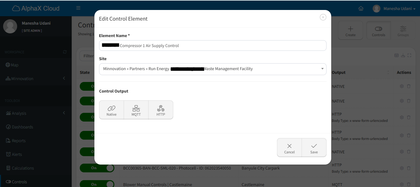
| Element Name* | The name of the control element, pre-filled with the current value but editable. |
| Site* | A dropdown menu to select or update the location associated with the control element. |
| Control Output* | Displays the current communication method (Native, MQTT, or HTTP). Users can switch to another method. |
| Field Name | Description |
|---|---|
| Topic* | The MQTT topic used for publishing messages. Pre-filled with the existing value, but editable. |
| Message (ON)* | The payload sent when the control is turned ON. |
| Message (OFF)* | The payload sent when the control is turned OFF. |
| User ID* | The username used to authenticate with the MQTT server. |
| Password* | Displays the password as obscured input (e.g., "•••••"). Users can modify this if necessary. |
| Server* | The MQTT server’s URL or IP address, pre-filled with the current value but editable. |
| Field Name | Description |
|---|---|
| Body Format | Options include x-www-form-URL encoded, raw, and binary. The current selection is pre-filled. |
| URL* | The endpoint URL for HTTP communication. Pre-filled with the current value but editable. |
| Message (ON)* | The payload sent when the control is turned ON. |
| Message (OFF)* | The payload sent when the control is turned OFF. |
| Button Name | Description |
|---|---|
| Cancel | Discards all changes and exits the view without saving. |
| Save | Saves the updated control element configuration. |
| Control Output | Additional Fields Displayed |
|---|---|
| Native | No additional fields are displayed. |
| MQTT | Fields for Topic, Messages (ON/OFF), User ID, Password, and Server appear. Password is obscured for security. |
| HTTP | Fields for Body Format, URL, and Messages (ON/OFF) appear. |
| Field Name | Description | Behaviour |
|---|---|---|
| Password* | Used to authenticate with the MQTT server. | Obscured input (e.g., "•••••"). |